-
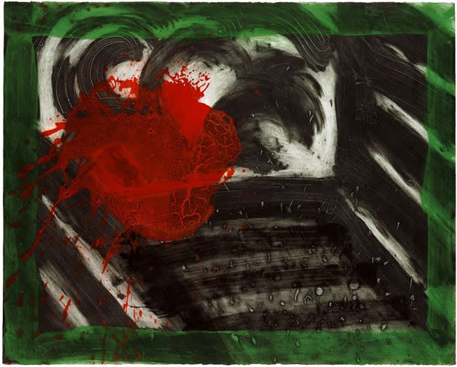
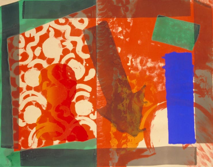
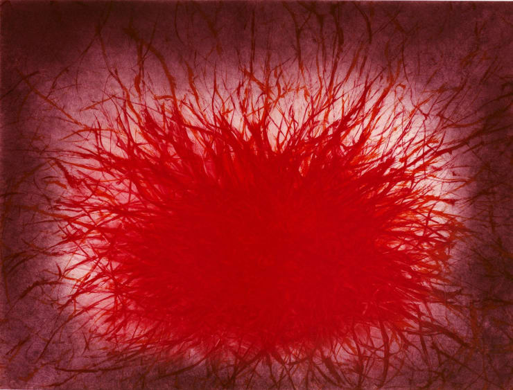
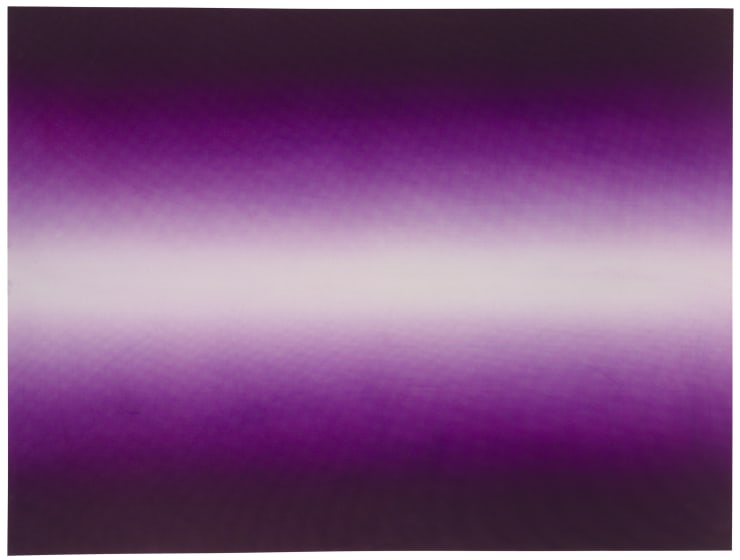
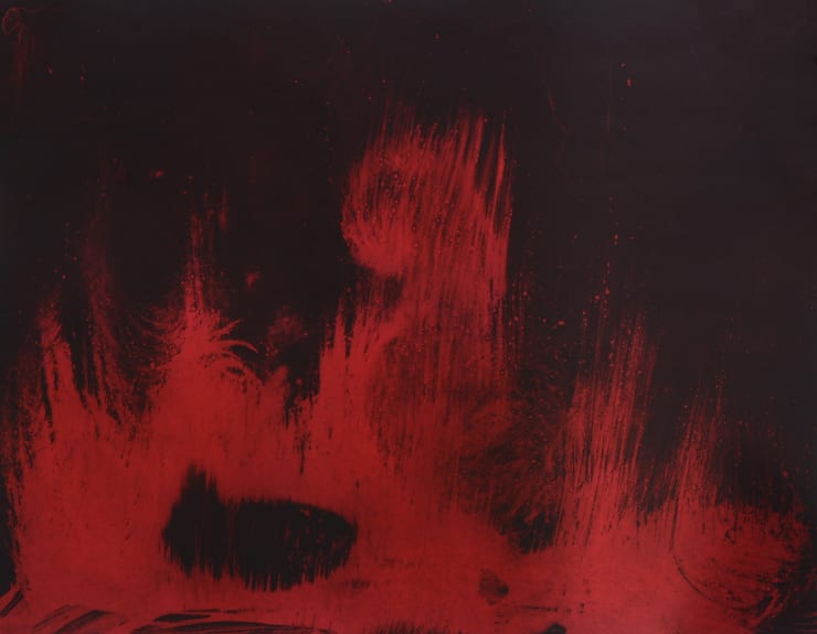
HOWARD HODGKIN | Flowering Palm & Night Palm
Hodgkin’s ‘Palm’ sequence of 1990-91 was his most ambitious graphic work to date and comprises, in our view, some of the most beautiful prints ever made by anyone. They are also a testament to the remarkable creative relationship Hodgkin forged with printmaker Jack Shirreff at 107 Workshop, a close collaboration that fundamentally shaped his graphic career.
‘Hodgkin’s fascination with large travel posters, seen in the Metro in Paris in the late 1950s or early 1960s is expressed in a series of four large intaglio prints made with carborundum: Night Palm, Street Palm, Palm and Window and Flowering Palm. They are equivalents to the travel posters in that they are huge, bright, spontaneous and straightforward. These large posters by artists such as Adolphe Mouron Cassandre (1901-68), Bernard Villemot (1911-89) and Raymond Savignac (1907-2002) were the only kind of prints that Hodgkin consciously tried to imitate. The Metro posters were loud, brightly coloured advertisements for companies such as French Railways, Air France and the French National Tourist Office. Hodgkin tried to achieve a similar immediacy, spontaneity and directness in the group of palm prints ... Spontaneity is important in his prints - a quality that his paintings lack ...
The execution of the marks should look, as indeed it does, unpremeditated and direct. The yellow paint in Flowering Palm looks as if it has been spontaneously and freely applied, whereas every stop and movement of the brush was calculated. When the yellow paint accidentally covered the red form at the centre of the print, the printer was instructed to wipe it off carefully. The green paint of Night Palm was intended to drip ‘spontaneously’ but within certain parameters.’
Extract from ‘Howard Hodgkin - The Complete Prints’, Liesbeth Heenk, 2003
-
PICASSO | Nature Morte au Citron et Pichet Rouge
Picasso’s collaboration with master printmakers, the Crommelynck brothers, provided an exhilarating dimension to his graphic work and their interpretations of his canvases in aquatint made a vital contribution to the development of colour etching. This etching, after ‘Nature morte au pichet’, originally painted in oil on canvas by Picasso in January 1937, is a particularly fine example.
‘The unsung heroes of art are its facilitators - those founders, engineers, printers and the like without whose technical prowess and ingenuity the works of others could not be realised, or at least, not with such bravura. The brothers Milan, Aldo and Piero Crommelynck had been sent to Paris to learn intaglio printing by their Belgian playwright father who had always regretted never being good with his hands. Fernand Crommelynck had intended his sons to become artists; instead they chose to bring to fruition the printed oeuvres of the giants of 20th-century art.
The Crommelyncks were responsible for almost half of Picasso’s intaglio images, a large portion of his entire graphic output. They even followed him down to Mougins in the South of France, setting up a makeshift studio in a former bakery to be close at hand.
Oddly enough, it is not the original prints that are the most immediately arresting here but the humbler ‘reproductions’ after his paintings. These aquatints, appropriately called ‘gravures d’interpretation’, are works of remarkable virtuosity. Here the brothers experimented with various toxic chemicals in order to achieve the requisite tonal and textural effects of impasted pigment and crayon. Nature Morte au Citron et Pichet Rouge and, appropriately enough, the image of Picasso’s house, Le Californie (intérieur rouge), are astonishingly fresh and vibrant ...’
Extract from ‘Picasso’s Printmakers Step into the Spotlight’, Apollo Magazine, March 2017
-
BARBARA HEPWORTH'S graphic output flourished towards the end of her career and was shaped in the main by a remarkable collaboration with The Curwen Studio. Curwen's Master Printer Stanley Jones provided the impetus for a series of projects, setting up a studio in St. Ives, so that he could work closely with Hepworth in order to develop a graphic counterpoint to her sculptural work. Hepworth would often work with Jones long into the night, creating lithographic plates before starting her sculpture again at dawn. Hepworth's printmaking and sculpture therefore became closely intertwined during a short but wonderfully fertile creative period. Hepworth's collaboration with Jones helped to codify new possibilities in the relationship between artist and Master Printer, and stands as a major contribution to the development of post war art in Britain.
-
HENRY MOORE | Standing Figures & Woman Holding Cat
Henry Moore was a pioneer of the collograph technique that adapted commercial colour separation methods to fine art printmaking in order to give the artist a greater control and freedom than the traditional lithographic process would allow. These two examples that Moore produced on the invitation of Ganeymed Press are a ground-breaking foray into a technique that would later also find expression in Moore’s famous ‘Shelter Sketchbook’ portfolio. The creative potential of the medium and its wider importance in the development of printmaking in post-war Britain is related in this description of the printing of one of the colour separations for ‘Standing Figures’:
‘The positive wash drawn for the yellow and the print made from it, show the extraordinary sensitivity of the process and it is a revelation to compare this yellow trial printing with the redrawn yellow on the completed print, in which the densities of the wash are redistributed in such a way that the figures now emerge three-dimensionally from their background in an unclouded clarity of blue. Moore relates that the moment when he saw the sum of his separate washes and drawings amalgamated into the first proof had something of the excitement of the potter viewing a glaze emerging from the kiln, or a sculptor seeing his plaster original cast in bronze. ‘Now when I make a plaster for metal, I know what will happen nearly exactly’ says Moore. ‘Then it used to be an excitement but also a trepidation. Well, the collograph was the same’.
‘Publishing experimental prints at the time, even by an artist with a name as illustrious as Moore’s, was a considerable act of faith. Although a healthy market had existed, especially for etching, at the beginning of the twentieth century, wars and economic crises severely crippled development and that later flowering, which has since been dubbed the British Print Renaissance, did not really get under way until the late 1950s and early 1960s. So, these collographs represent an exceptionally early stirring of the post-war interest in artists’ prints.’
Extract from ‘Henry Moore Graphics in the Making’, Tate Gallery, 1975
-
-
 David HockneyRampant, 1991Sold
 -
 David HockneySunflower I, 1995Sold
 -
 David HockneySunflower II, 1995Sold
 -
 David Hockney, Two Peppers, 1973
 -
 David HockneyA Moving Still Life, 1976-77Sold
 -
 David HockneyA Tune, 1976-77£5,750.00
 -
 David HockneyThe Buzzing of the Blue Guitar, 1976-77£5,750.00
 -
 David HockneyThe Blue Guitar, 1976-77Sold
 -
 David HockneyFigures with Still Life, 1976-77Sold
-
-
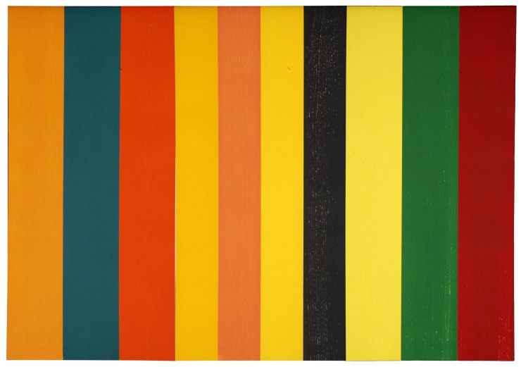
TERRY FROST | Timberaine D
The Timberaine series is a compelling meditation on pure colour and Frost sustained the idea across a sequence of 10 variations in total. Timberaine D is from a relatively small edition of 16 and good examples very rarely come to market. Frost’s publisher, Charles Booth-Clibborn provides background to the series:
‘The idea for the Timberaine woodcuts originated from a large painting of stripes that Terry had recently completed, which itself was inspired by the trunks of trees in a forest. Terry referred to the painting as ‘a jungle’ and concocted the title from the words ’timber’ and ‘rainforest’: ‘I wanted a title that described what I was doing. ‘Timberaine’ is a rainforest. It is about timber and trunks.
’Terry wanted to develop the stripe theme further and felt that this was best served by exploring it in a series of six different ‘jungle’ scenarios through the medium of woodcut. Woodcut also allowed him to accomplish the quality and clarity of design he envisioned, contrary to the painting in which the edges of the stripes were inevitably softer. Terry made one full-size preparatory sketch from which Hugh cut the woodblocks. One block was cut for each colour stripe, with a total of ten blocks. Under the guidance of Hugh, Terry chose a specific grain of wood - ash, this time - to create the most appropriate surface texture for the series. The same blocks were used for each triptych, using different colour variations. Terry relished playing with the value and weight of colours, relating them to each other and arranging them in different sequences.’
Extract from ‘Terry Frost Prints - A Catalogue Raisonné’, Dominic Kemp 2010
-
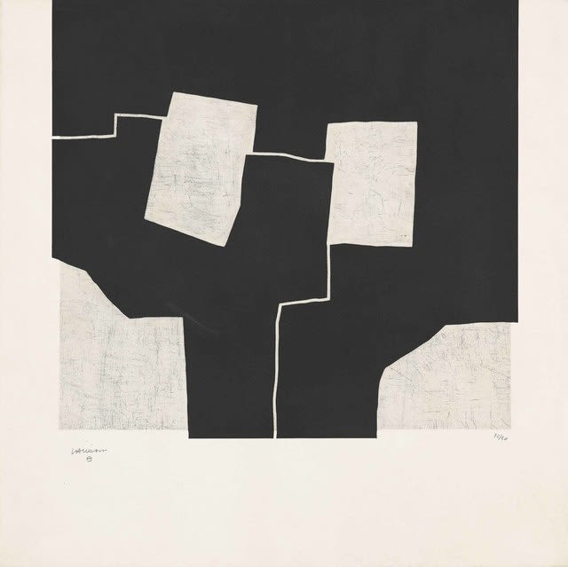
EDUARDO CHILLIDA | Urrutiko
Examples of Chillida’s graphic work are a rare find and large format examples such as this are rarer still. His work is always a welcome addition to the collection and allows us to further explore the dialogue between printmaking and sculpture - a subject that has been a particular fascination for us in the gallery in recent years.
‘Chillida began working in lithography, etchings, silkscreen and woodcuts in 1950, and printmaking represented a significant part of his artistic output thereafter. His graphic works are not mere references to his sculptural work, but artistic expressions in their own right and like his sculpture, they display a preoccupation with form, space and framing. Absence is therefore as important as presence. The balance of dualities such as black/white, heaviness/lightness and emptiness/fullness give Chillida’s work a universal importance: a forum to contemplate our boundaries and freedoms.
In Chillida’s early graphic works, the composition was often dominated by unconnected strokes. During the 1960s he also developed black panes with white internal lines to form compositions and this idea continued well into the 1970s. These black block-like surfaces, with straight lines and perfect angles, gave the appearance of recognizable shapes and helped to infuse the works with a sense of order. Chillida worked mainly in etching, embracing the full materiality of the technique. Instead of using the basic rectangular plate, he would often cut the etched plate into a shape leaving the shaped plate mark when pressed: the embossing becomes part of the composition. From the 1980s, Chillida used embossing or relief, to give a more pronounced third dimension to his graphic works. This use of embossing became increasingly important until it became one of the most significant features of his etching technique.’
Extract from ‘Eduardo Chillida Graphic Works’, Adam Gallery, 2009


